Dentsu Office Space Design
Dentsu Office Space Design
Dentsu Office Space Design
Environmental Design
Environmental Design
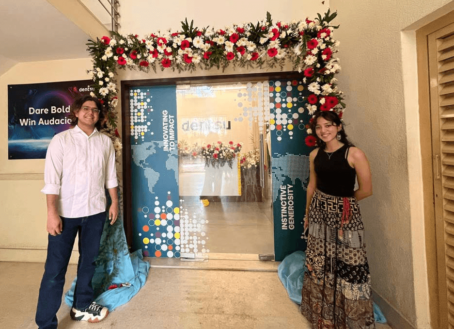
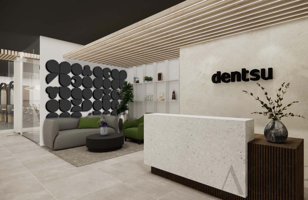
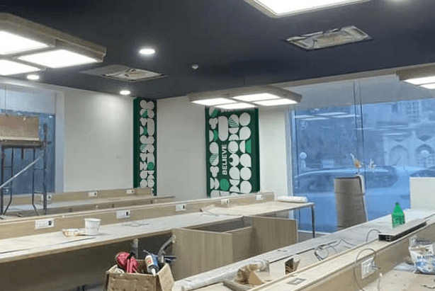
During my time at Dentsu Creative, I had the opportunity to design the wall graphics and interiors for a newly opened corporate office. Working as part of a small team of 2, we were tasked with creating a cohesive visual experience, which included graphics for the walls and glass surfaces, as well as a striking feature wall with custom-built clocks of different time zones. The office space was made for the tech and finance departments respectively, and our designs aimed to reflect that.
During my time at Dentsu Creative, I had the opportunity to design the wall graphics and interiors for a newly opened corporate office. Working as part of a small team of 2, we were tasked with creating a cohesive visual experience, which included graphics for the walls and glass surfaces, as well as a striking feature wall with custom-built clocks of different time zones. The office space was made for the tech and finance departments respectively, and our designs aimed to reflect that.
During my time at Dentsu Creative, I had the opportunity to design the wall graphics and interiors for a newly opened corporate office. Working as part of a small team of 2, we were tasked with creating a cohesive visual experience, which included graphics for the walls and glass surfaces, as well as a striking feature wall with custom-built clocks of different time zones. The office space was made for the tech and finance departments respectively, and our designs aimed to reflect that.
Design Development
Design Development
Our initial designs incorporated the use of the Dentsu shapes and colour pallet, in order to keep the branding consistent across the digital and physical spaces of Dentsu, but these designs were unfortunately rejected. We were told to tone down the designs to be more generic, but still unique to better fit the tech and finance departments.
Our initial designs incorporated the use of the Dentsu shapes and colour pallet, in order to keep the branding consistent across the digital and physical spaces of Dentsu, but these designs were unfortunately rejected. We were told to tone down the designs to be more generic, but still unique to better fit the tech and finance departments.
Our initial designs incorporated the use of the Dentsu shapes and colour pallet, in order to keep the branding consistent across the digital and physical spaces of Dentsu, but these designs were unfortunately rejected. We were told to tone down the designs to be more generic, but still unique to better fit the tech and finance departments.
Previous Project
Previous
Project
Previous Project
Next Project
Next
Project
Next Project


